the key elements of a visual lookbook
in this article, we’ll discuss what elements typically are included in a visual look-book. we’ll also talk about how these elements change based on the industry it is used in. this is the second installment of our 4 part article series breaking down visual lookbooks and how they can improve your creative process. you can read the first installment here: https://www.jkyhcbll.com/blog/whatisalookbook
how is a lookbook used in different industries?
in film, we call it a lookbook and sometimes a pitch deck or a bible. they all serve to achieve the same purpose in a sense and that is to get the entire creative team on one accord which we discussed in our previous article. you can read that here:
lookbooks, pitch decks, and bibles differ slightly however, there is some overlap in the elements present in each document.
as a pitch deck suggests, it is more-so used to pitch an idea and contains more of the logistic and financial side of the project such as budget, how funds will be allocated as well as marketing and distribution strategies. the pitch deck is used when pitching to studio executives, financiers, or investors. while a lookbook is mostly used between the director, cinematographer, production designer or art director, and the rest of the crew. it's created so that the team/crew can see the vision for the project and will include visual ideas and any other details necessary for understanding and interpreting the creative vision and theme of the project.
a TV bible is more-so used when pitching tv-series and is an in-depth lookbook that also dives deep into the world, concept, and plot of the entire TV series. it should feature storylines, characters visual references, and media that is similar to your project such as films, tv shows, books, etc. as well as franchise potential and even some marketing and distribution strategies.
i encourage you to check out the stranger things TV bible here: http://www.zen134237.zen.co.uk/Stranger_Things/Stranger_Things_-_Bible.pdf
if you haven’t seen the series this is going to make you want to watch it and if you have seen the series, this is going to make you want to rewatch it.
a treatment is used for music videos and short-form content and depending on your preference in creating it you can make it more visual or wordier. it's really up to you because the point is to articulate your vision but remember... this is a visual medium. because i come from a film background my treatments tend to look a lot more like lookbooks but it varies from project to project.
a creative brief is used more in the. advertising, marketing, and design industries. it serves a similar purpose but is more so a general overview of the entire project, the specifications, deadlines, execution as well as creative direction for the project, marketing objectives, so on and so forth. creative briefs can take the shape of a lookbook but tend to be a bit more like a pitch deck in terms of content.
when should you create a lookbook and where is it necessary?
i think it is necessary for just about every project and you can literally use it at any time! it will help you stay organized and also execute more abstract and artistic ideas by adding new layers to your content and more attention to detail! this process goes a long way and it will improve the way you approach and execute your creative ideas immensely!
you can use lookbooks for just about anything! here are some of the creative projects a lookbook would be useful for:
youtube videos/content creation
music video concepts & ideas
album cover concepts
film projects (short, documentary, feature, tv)
marketing campaigns
book pitches
album roll-outs
product launches
youtube videos
web development
visual inspiration
to pitch to brands for sponsorships
and sooooo much more!
now finally, let’s get into the elements of a lookbook.
what are the key elements of a lookbook/treatment?
this example is what i use for my directorial work (film projects, music videos & photography projects)
TITLE PAGE
production/project title
treatment by
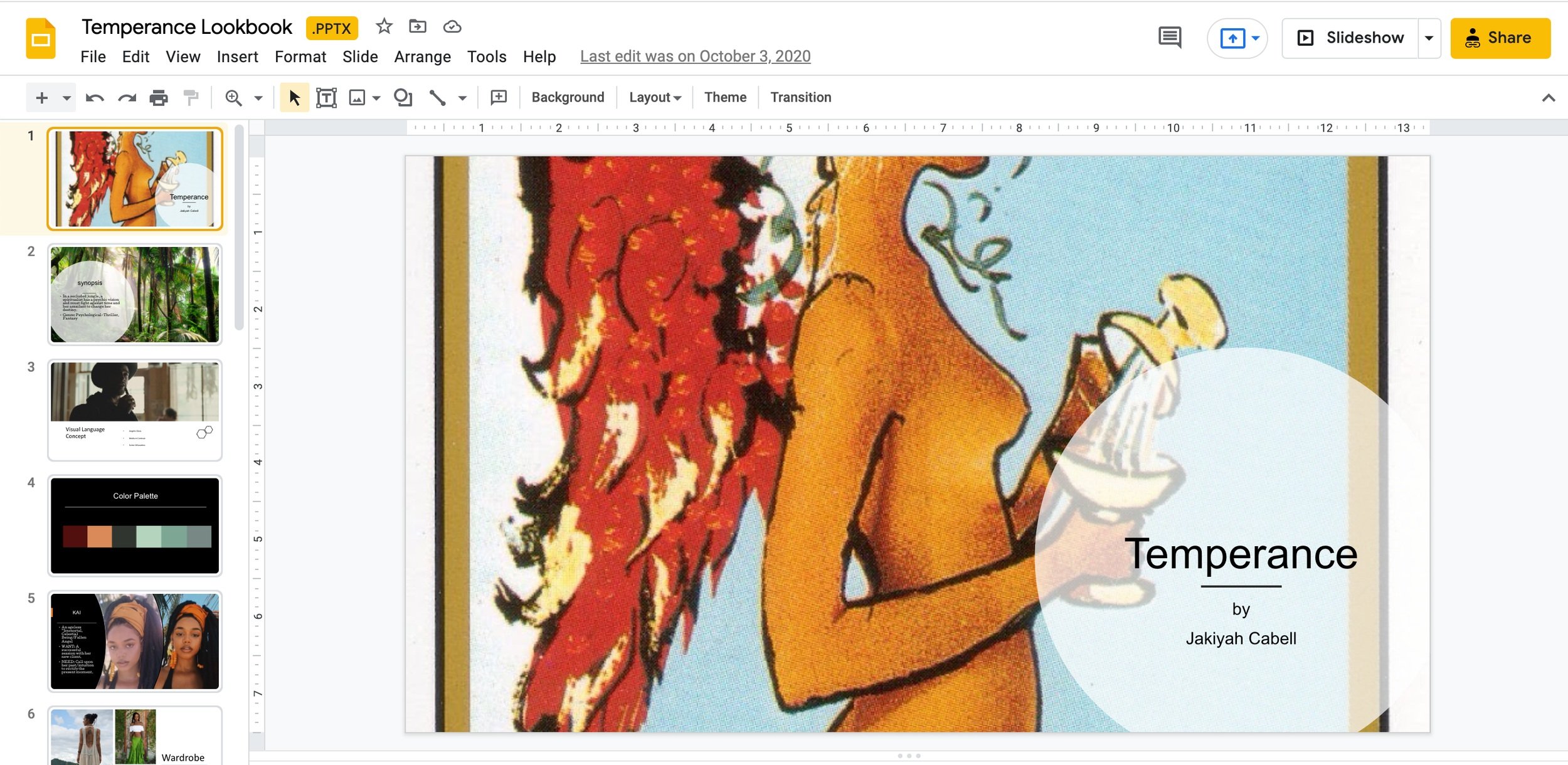
every lookbook needs a title page. the title page should include the title of the project and who prepared the lookbook/treatment.
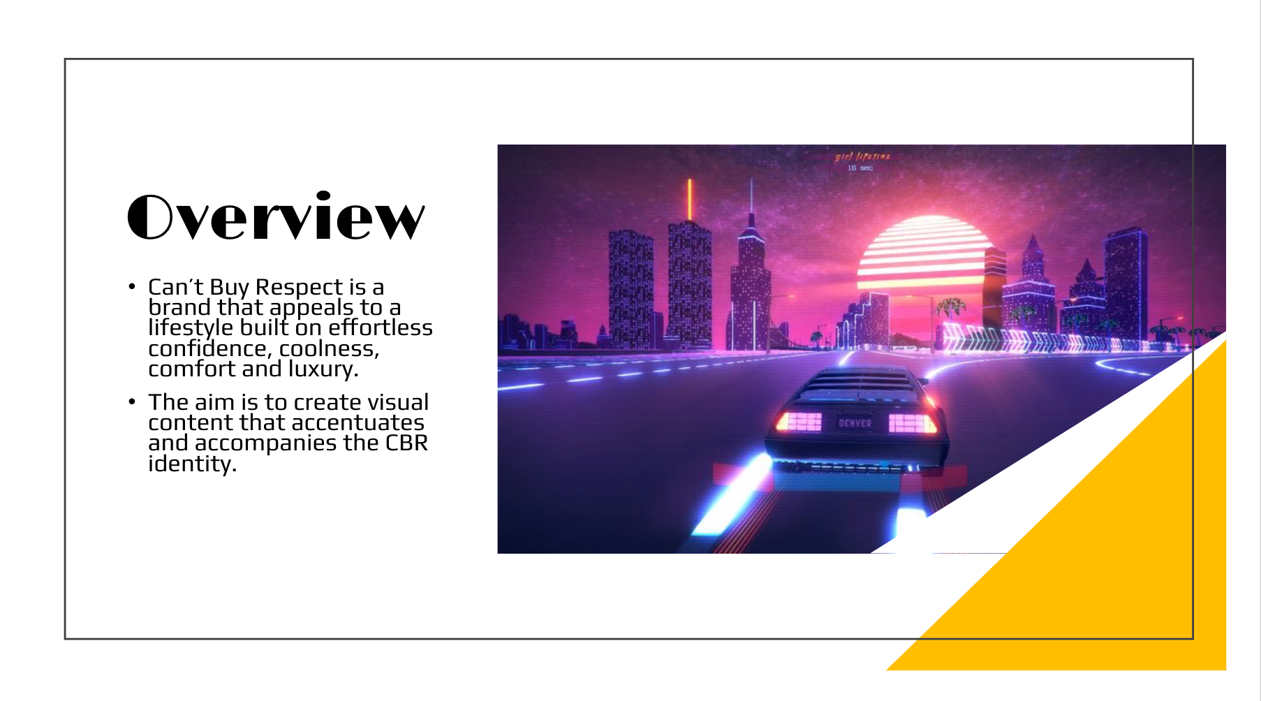
a sample media deck created by jakiyah cabell for the streetwear and lifestyle brand Can’t Buy Respect. (2020)
SYNOPSIS/CONCEPT OVERVIEW
overview of the concept of the project. the goals for the project. the sound. etc.
a sample media deck created by jakiyah cabell for the streetwear and lifestyle brand Can’t Buy Respect. (2020)
VISUAL LANGUAGE
some key points and imagery around your visual and aesthetic choices.
a sample media deck created by jakiyah cabell for the streetwear and lifestyle brand Can’t Buy Respect. (2020)
a mock music video treatment made by jakiyah cabell for IAMDDB’s “Scare You”. (2020)
COLOR PALETTE(S)
color palettes help tell the overall visual story. you can create them using canva and coolors. https://coolors.co/ https://www.canva.com/colors/color-palette-generator/
a screenshot of the color palette from the lookbook of “TEMPERANCE” a short film written and direced by jakiyah cabell. (2020)
a mock music video treatment made by jakiyah cabell for IAMDDB’s “Scare You”. (2020)
a sample media deck created by jakiyah cabell for the streetwear and lifestyle brand Can’t Buy Respect. (2020)
CAST/MODELS
who are they? include photos of the actual cast/models or of people who fit the archetype that you are going for. create a new page for each actor/model.
a screenshot from the lookbook of “TEMPERANCE” a short film written and direced by jakiyah cabell. (2020)
WARDROBE/STYLING
what are they wearing? visual references and photos of the actual pieces you will be styling or hoping to source for the project. talk about how the wardrobe helps tell the story and achieve the goal of the campaign. what are the emotional cues being made with the wardrobe choices? keep it visual though.
a screenshot from the lookbook of “TEMPERANCE” a short film written and direced by jakiyah cabell. (2020)
MAKE-UP
visual references and inspiration for the make-up and the emotional effect that is hoped to be achieved with this choice.
a screenshot from the lookbook of “TEMPERANCE” a short film written and direced by jakiyah cabell. (2020)
LOCATION
visual references. describe the space. set design. colors. what's taking place in each scene/location. if you have more than one location create a new page for each new location/set/scene.
a mock music video treatment made by jakiyah cabell for IAMDDB’s “Scare You”. (2020)
PROPS & SET DRESSING
what does the set look like? how is it designed and dressed? furniture? colors? textures? what props will be needed for each scene?
a screenshot from the lookbook of “TEMPERANCE” a short film written and direced by jakiyah cabell. (2020)
LIGHTING & COMPOSITION
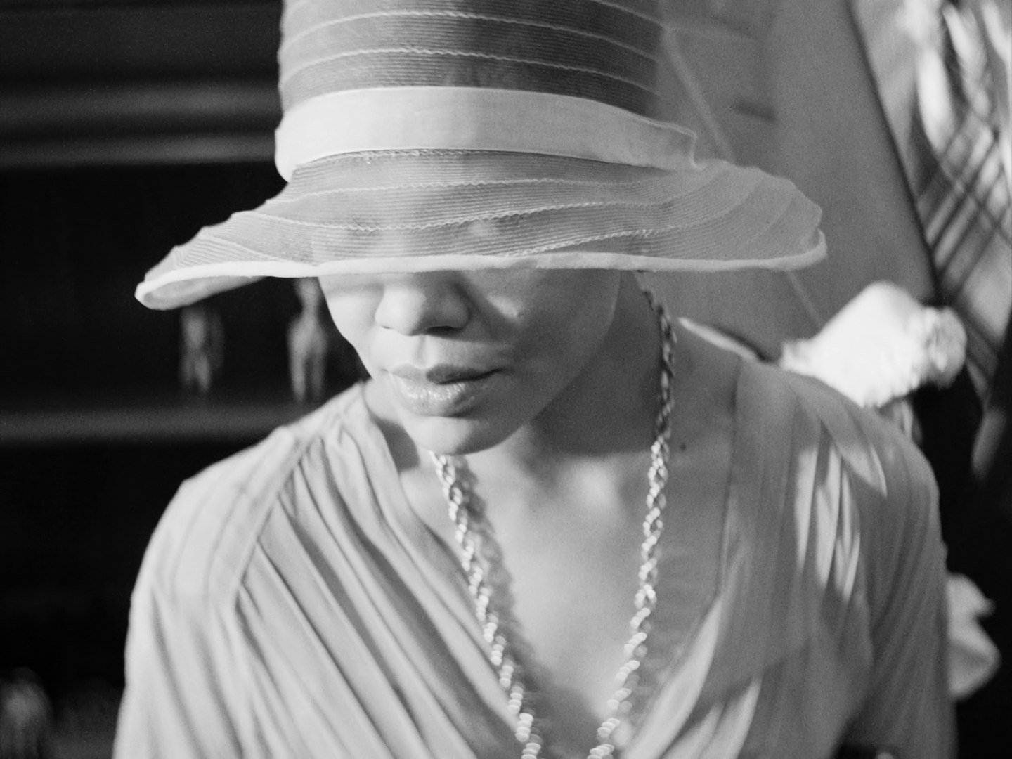
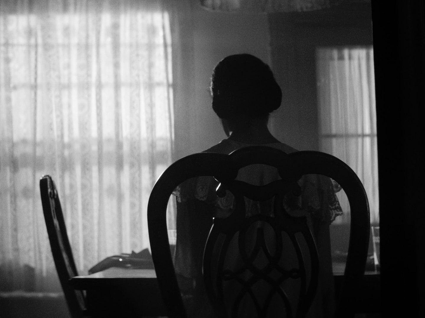
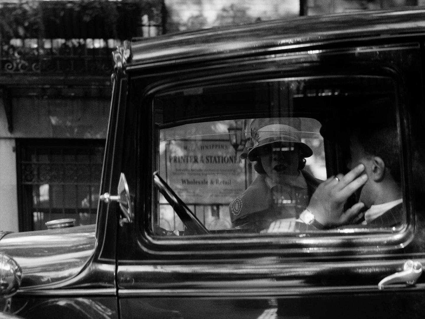
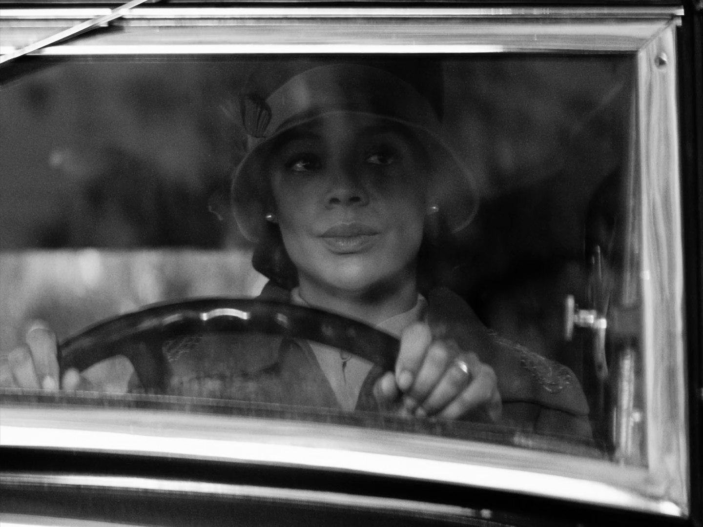
lighting choices and composition. include visual references for what the lighting should look like and the goal. include references for shot composition as well. include as many as you need to. this way the team is on the same page and your vision is properly communicated.
still is from the film Passing (2021).
VISUAL INSPIRATION
include advertisements, artwork, songs, and anything that you are gathering inspiration from. the more detail the better. this can have both words and visuals. or just be visual but the point is to really go in-depth into your creative vision and creative approach.
what films is it like?
still is from the film Passing (2021).
MORE VISUAL INSPIRATION
still is from the film Passing (2021).
MORE VISUAL INSPIRATION
still is from the film Passing (2021).
MORE VISUAL INSPIRATION
MORE VISUAL INSPIRATION
MORE VISUAL INSPIRATION
MORE VISUAL INSPIRATION
MORE VISUAL INSPIRATION
MARKETING PLAN & OBJECTIVE
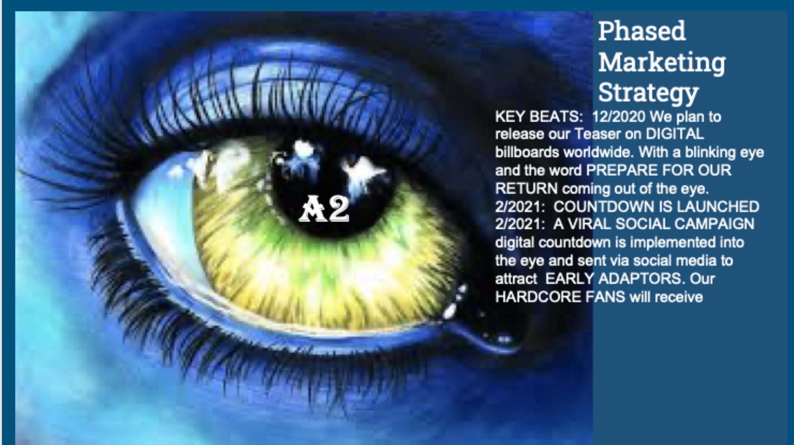
how will this be marketed and what is your objective for this roll-out. goals for when this successfully launches? projects similar to yours? (for film projects) what did they make in the box office? what was their budget? etc. these are some of the questions you should answer in these slides.
screenshot is from a mock digital marketing campaign made by jakiyah and friends for Avatar 2’s release. (2020)
MARKETING TIMELINE
detail the timeline of your marketing plan from start to finish. how long will this campaign run? when does it launch? when does it end?
screenshot is from a mock digital marketing campaign made by jakiyah and friends for Avatar 2’s release. (2020)
CLOSING REMARKS
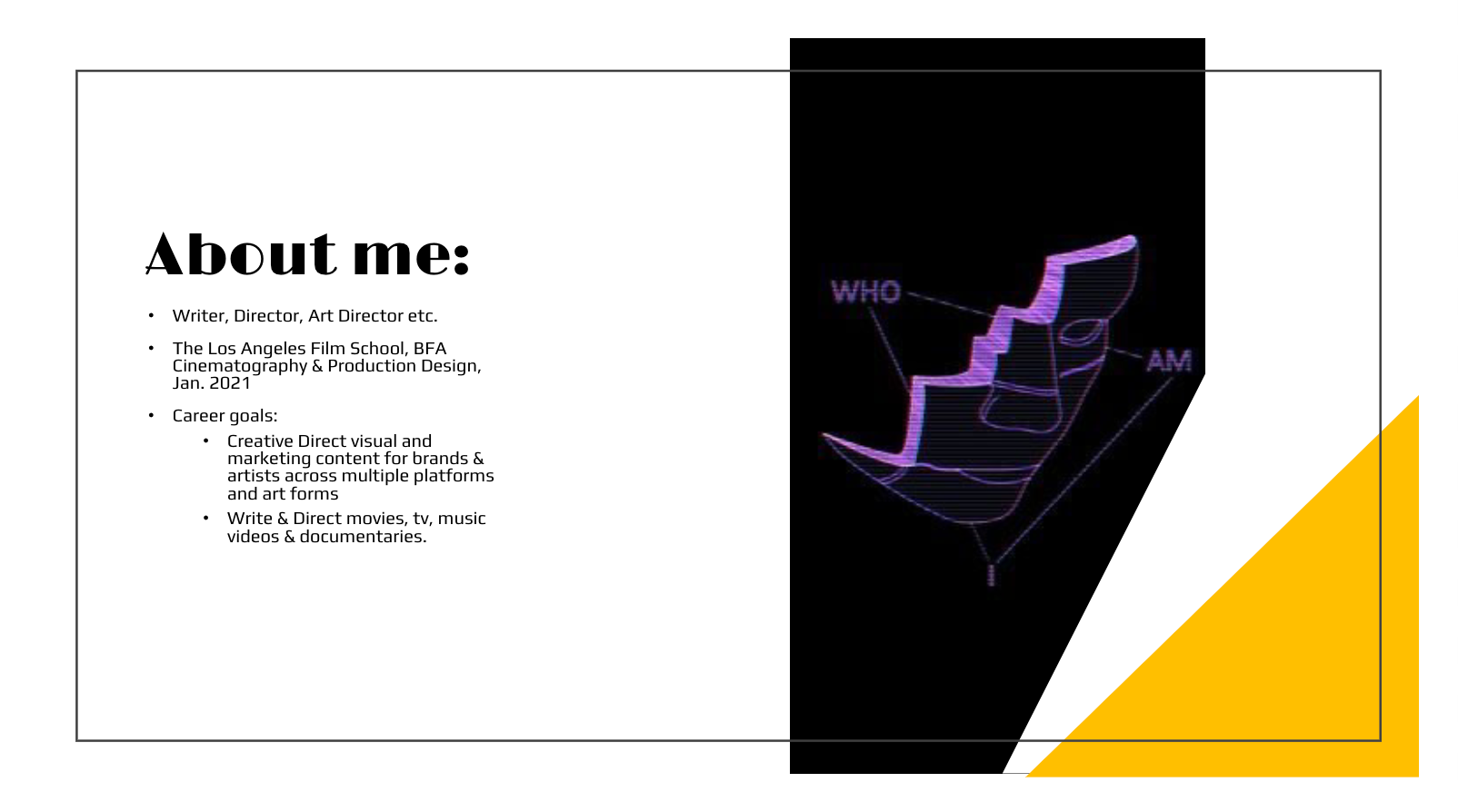
any last thoughts? if you are pitching a music video treatment to an artist; who are you and why are you the perfect fit for this project? why do you want to direct this project?
screenshot is from a media deck created by jakiyah cabell circa 2020.
now that we have discussed elements of a lookbook let’s get into how to create one! you can read the next article in this series here: https://www.jkyhcbll.com/blog/howtocreatealookbook
the music video treatment and lookbook example
download jakiyah cabell’s mock music video treatment for speechless by beyoncé!

